Sử dụng layout trong HTML
Giới thiệu nội dung bài viết
Khi bạn truy cập vào một website nào đó, thứ đầu tiên bạn sẽ nhìn thấy là hình thức, bố cục của website. Vậy bạn có thắc mắc làm cách nào để tạo ra những phần trong website, như thế nào để bố trí và sắp xếp các thành phần chính cho một website không?
Bài viết hôm nay anh sẽ chia sẻ về cách bố trí các thành phấn chính cho một website trong lập trình web HTML, layout trong lập trình web HTML là gì? Sau đó anh sẽ trình bày thêm về các phần tử HTML để làm ra bố cục của một trang website trong lập trình web HTML bao gồm thẻ header, nav, section, article, aside, footer. Cũng như áp dụng được các kĩ thuật trong quá trình làm bố cục một website gồm 4 phương pháp: sử dụng CSS Framework, thuộc tính CSS Float, CSS Flex, CSS Grid.
1. Layout của một website
Khi vào một trang website nào các em sẽ thấy họ bố trí website gồm 4 phần chính.
-
Phần trên cùng được gọi là header của trang web. Phần này thường để banner của website. Các em có thể thấy Blog của anh, phần trên cùng là banner hình của anh
-
Phần bên trái được gọi là aside, nơi mình để các link liên kết tới các trang trong website
-
Phần ở dưới cùng gọi là footer nơi này thường để những thông tin như email, nhà phá hành trang web, thông tin liên hệ
-
Phần cuối (màu trắng ở giữa) người ta gọi là container nơi mình chứa nội dung của website
Thông thường 1 website thường có 4 phần trên.
2. Các phần tử html để làm bố cục một website
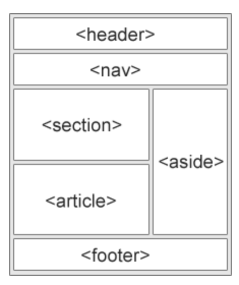
- Để làm header của website chúng ta sử dụng thẻ <header>
- Thẻ <nav> được sử dụng để tạo các menu ngang trên header
- Thẻ
định nghĩa các khu vực trong website. Website mình có thể chia ra nhiều khu vực - Thẻ <article> nó cũng giống như session nhưng nội dung nó là độc lập. Thường các website về tin tức họ sẽ sử dụng thẻ article này còn website bán hàng hoặc thương mại điện tử thì dùng session
- Thẻ <aside> dùng để làm chứa các liên kết của website. Nó thường đặt bên trái của website
- Thẻ <footer> dùng để làm footer của một website nơi ta để thông tin website
3. Các kỹ thuật làm bố cục một website
Để làm bố cục của một website như trên ta có 4 phương pháp làm :
- Chúng ta có thể sử dụng css framework
- Chúng ta có thể sử dụng thuộc tính CSS float để bố cục các thành phần
- Chúng ta có thể sử dụng CSS flex
-
Chúng ta có thể sử dụng CSS Grid
-
Để tạo được trang web có giao diện như blog của anh gồm 4 thành phần thì các em có thể sử dụng CSS framework là Bootstrap. Để tìm hiểu về bootstrap các em có thể coi các bài viết tại đây
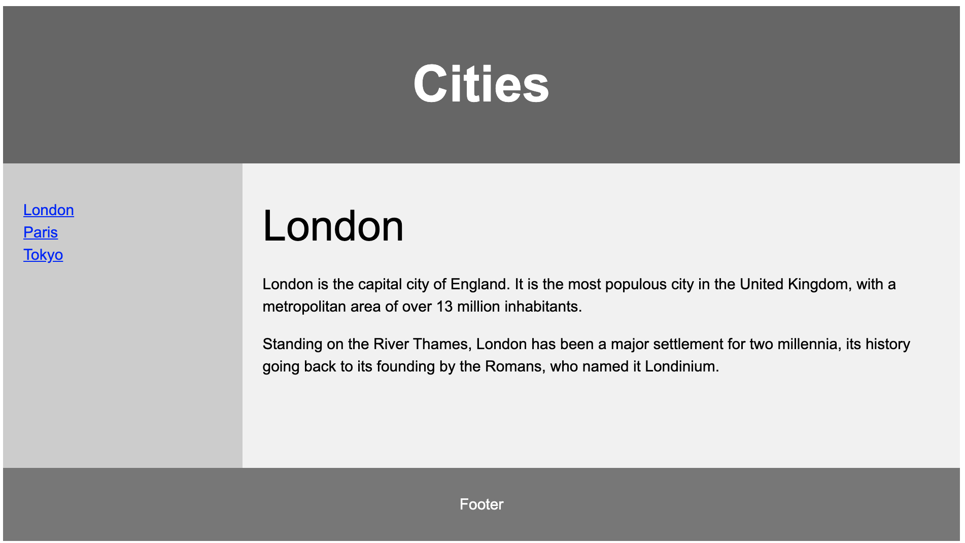
- Dùng thuộc tính float để tạo bố cục như hình sau
1
2
3
4
5
6
7
8
9
10
11
12
13
14
15
16
17
18
19
20
21
22
23
24
25
26
27
28
29
30
31
32
33
34
35
36
37
38
39
40
41
42
43
44
45
46
47
48
49
50
51
52
53
54
55
56
57
58
59
60
61
62
63
64
65
66
67
68
69
70
71
72
73
74
75
76
77
78
79
80
81
82
83
84
85
86
87
88
89
90
91
92
93
94
95
96
97
98
99
100
101
102
103
<!DOCTYPE html>
<html lang="en">
<head>
<title>CSS Template</title>
<meta charset="utf-8">
<meta name="viewport" content="width=device-width, initial-scale=1">
<style>
* {
  box-sizing: border-box;
}

body {
  font-family: Arial, Helvetica, sans-serif;
}

/* Style the header */
header {
  background-color: #666;
  padding: 30px;
  text-align: center;
  font-size: 35px;
  color: white;
}

/* Create two columns/boxes that floats next to each other */
nav {
  float: left;
  width: 30%;
  height: 300px; /* only for demonstration, should be removed */
  background: #ccc;
  padding: 20px;
}

/* Style the list inside the menu */
nav ul {
  list-style-type: none;
  padding: 0;
}

article {
  float: left;
  padding: 20px;
  width: 70%;
  background-color: #f1f1f1;
  height: 300px; /* only for demonstration, should be removed */
}

/* Clear floats after the columns */
section:after {
  content: "";
  display: table;
  clear: both;
}

/* Style the footer */
footer {
  background-color: #777;
  padding: 10px;
  text-align: center;
  color: white;
}

/* Responsive layout - makes the two columns/boxes stack on top of each other instead of next to each other, on small screens */
@media (max-width: 600px) {
  nav, article {
    width: 100%;
    height: auto;
  }
}
</style>
</head>
<body>

<h2>CSS Layout Float</h2>
<p>In this example, we have created a header, two columns/boxes and a footer. On smaller screens, the columns will stack on top of each other.</p>
<p>Resize the browser window to see the responsive effect (you will learn more about this in our next chapter - HTML Responsive.)</p>

<header>
  <h2>Cities</h2>
</header>

<section>
  <nav>
    <ul>
      <li><a href="#">London</a></li>
      <li><a href="#">Paris</a></li>
      <li><a href="#">Tokyo</a></li>
    </ul>
  </nav>

  <article>
    <h1>London</h1>
    <p>London is the capital city of England. It is the most populous city in the  United Kingdom, with a metropolitan area of over 13 million inhabitants.</p>
    <p>Standing on the River Thames, London has been a major settlement for two millennia, its history going back to its founding by the Romans, who named it Londinium.</p>
  </article>
</section>

<footer>
  <p>Footer</p>
</footer>

</body>
</html>
- Sử dụng flex box để tạo bố cục
1
2
3
4
5
6
7
8
9
10
11
12
13
14
15
16
17
18
19
20
21
22
23
24
25
26
27
28
29
30
31
32
33
34
35
36
37
38
39
40
41
42
43
44
45
46
47
48
49
50
51
52
53
54
55
56
57
58
59
60
61
62
63
64
65
66
67
68
69
70
71
72
73
74
75
76
77
78
79
80
81
82
83
84
85
86
87
88
89
90
91
92
93
94
95
96
97
98
99
100
101
102
103
104
<!DOCTYPE html>
<html lang="en">
<head>
<title>CSS Template</title>
<meta charset="utf-8">
<meta name="viewport" content="width=device-width, initial-scale=1">
<style>
* {
  box-sizing: border-box;
}

body {
  font-family: Arial, Helvetica, sans-serif;
}

/* Style the header */
header {
  background-color: #666;
  padding: 30px;
  text-align: center;
  font-size: 35px;
  color: white;
}

/* Container for flexboxes */
section {
  display: -webkit-flex;
  display: flex;
}

/* Style the navigation menu */
nav {
  -webkit-flex: 1;
  -ms-flex: 1;
  flex: 1;
  background: #ccc;
  padding: 20px;
}

/* Style the list inside the menu */
nav ul {
  list-style-type: none;
  padding: 0;
}

/* Style the content */
article {
  -webkit-flex: 3;
  -ms-flex: 3;
  flex: 3;
  background-color: #f1f1f1;
  padding: 10px;
}

/* Style the footer */
footer {
  background-color: #777;
  padding: 10px;
  text-align: center;
  color: white;
}

/* Responsive layout - makes the menu and the content (inside the section) sit on top of each other instead of next to each other */
@media (max-width: 600px) {
  section {
    -webkit-flex-direction: column;
    flex-direction: column;
  }
}
</style>
</head>
<body>

<h2>CSS Layout Flexbox</h2>
<p>In this example, we have created a header, two columns/boxes and a footer. On smaller screens, the columns will stack on top of each other.</p>
<p>Resize the browser window to see the responsive effect.</p>
<p><strong>Note:</strong> Flexbox is not supported in Internet Explorer 10 and earlier versions.</p>

<header>
  <h2>Cities</h2>
</header>

<section>
  <nav>
    <ul>
      <li><a href="#">London</a></li>
      <li><a href="#">Paris</a></li>
      <li><a href="#">Tokyo</a></li>
    </ul>
  </nav>

  <article>
    <h1>London</h1>
    <p>London is the capital city of England. It is the most populous city in the  United Kingdom, with a metropolitan area of over 13 million inhabitants.</p>
    <p>Standing on the River Thames, London has been a major settlement for two millennia, its history going back to its founding by the Romans, who named it Londinium.</p>
  </article>
</section>

<footer>
  <p>Footer</p>
</footer>

</body>
</html>
4. Kết luận
Trong thực tế làm website thì anh hay sử dụng CSS Framework là Bootstrap để xây dựng bố cục và các thành phần của website. Vì mình chỉ cần sử dụng lại các thư viện có sẵn của Framework giúp phát triển website nhanh hơn.
Mọi người hãy Subscribe kênh youtube dưới đây nhé để cập nhật các video mới nhất về kỹ thuật và kỹ năng mềm
Các khoá học lập trình MIỄN PHÍ tại đây
Comments